Collection List Page – All & Selected Collections
The Subcollection block is used to display collections within the collection list page. It helps organize and present multiple collections in a structured layout, making it easier for users to browse and navigate through categories.
This block supports flexible layouts, filtering, and display controls to adapt to different merchandising needs.
Key Feature
- Supports two display modes:
- All Collections → Automatically displays all available collections
- Selected Collections → Allows manual selection of specific collections
This flexibility enables both dynamic listing and curated collection showcases.
Selected Collections allows you to manually select and display up to 5 collections.
Settings
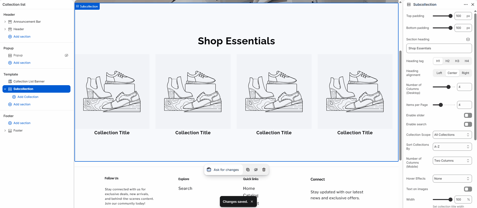
Subcollection Section Settings
| Setting | Type | Description |
|---|---|---|
| Top padding / Bottom padding | range | Adjusts the spacing above and below the section. |
| Section heading | text | Sets the main title displayed above the collections. |
| Heading tag | select | Defines the HTML tag (H1–H4) for SEO structure. |
| Heading alignment | select | Aligns the section title (Left, Center, Right). |
| Number of Columns (Desktop) | range | Controls how many collections appear per row on desktop. |
| Items per page | range | Sets how many collections are displayed initially. |
| Enable slider | checkbox | Turns the layout into a horizontal slider. |
| Enable search | checkbox | Adds a search input to filter collections. |
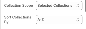
| Collection Scope | select | Chooses between All Collections or Selected Collections. |
| Sort Collections By | select | Defines sorting order (e.g. A–Z). |
| Number of Columns (Mobile) | select | Controls layout on mobile devices. |
| Hover Effects | select | Applies visual effects on hover. |
| Text on images | checkbox | Displays collection titles over images. |
| Width | range | Controls the width of the collection title area. |
| Title Color | color | Sets the color of collection titles. |
| Text Protection | range | Adds overlay to improve text readability on images. |
| Tab Type | select | Defines tab styling (used with selected collections). |
| Color scheme | select | Applies a predefined color theme. |
Collection Block Settings
| Setting | Type | Description |
|---|---|---|
| Main Collection | collection picker | Selects the primary collection. |
| Main collection tab title | text | Sets a custom title for the collection tab. |
| Subcollection | collection picker | Selects a subcollection to display. |
| Icon | select | Chooses an icon for visual representation. |
| Alt Tag for Subcollection image | text | Adds descriptive text for accessibility and SEO. |
Note
- Collection block settings are applied only when a Subcollection is selected.
- Each block works independently, allowing you to control collections individually.
Theme Settings
| Setting | Type | Description |
|---|---|---|
| Image padding | range | Adds spacing inside collection cards. |
| Thickness | range | Controls border thickness. |
| Opacity | range | Adjusts overlay transparency. |
| Corner radius | range | Defines rounded corners for cards. |
| Horizontal / Vertical offset | range | Controls shadow or element positioning. |
| Blur | range | Applies blur effect to shadows. |
| Style | select | Switches between Standard and Card layouts. |
| Text alignment | select | Aligns text inside collection cards. |
Notes
- Use All Collections for dynamic and automatically updated listings.
- Use Selected Collections for curated and strategic merchandising.
- Enable search when displaying a large number of collections.
- Slider mode is ideal for mobile-focused layouts or limited space.
- Adjust columns and spacing to maintain a balanced layout across devices.