Discount
Provide your customers with a simple banner that can be for promotions, discounts, anything you like.
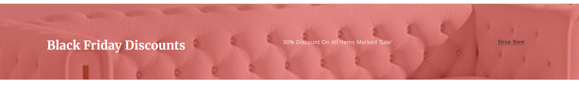
The Discount section is designed to highlight promotions, campaigns, or time-limited offers using image or color backgrounds, optional overlays, call-to-action buttons, and an optional countdown timer.


| Setting | Type | Options / Values | Description |
|---|---|---|---|
| Section Width | Select | Full width, Full width padded | Controls the overall section width. |
| Background | Toggle | Image, Color | Choose whether to use an image or solid color background. |
| Show Border | Checkbox | On / Off | Displays a border around the section. |
| Border Color | Color Picker | Any color | Border color when enabled. |
| Overlay Color | Color Picker | Any color | Overlay color applied over the background image. |
| Overlay Opacity | Range | 0–100% | Controls the darkness/transparency of the overlay. |
| Header | Text | Custom text | Main heading displayed in the discount section. |
| Text | Textarea | Custom text | Primary description/content text. |
| Text (Secondary) | Textarea | Custom text | Additional optional text content. |
| Image | Image Picker | Shopify Image | Promotional image displayed in the section. |
| Image Alt Tag | Text | Custom text | Alt text used for accessibility and SEO. |
| Enable Lazy-load | Checkbox | On / Off | Delays image loading until visible on screen. |
| Image Size Mode | Select | Height, Aspect Ratio | Determines how image dimensions are controlled. |
| Mobile Height | Range | px value | Image height on mobile devices. |
| Desktop Height | Range | px value | Image height on desktop devices. |
| Top Padding | Range | px value | Space above the section. |
| Bottom Padding | Range | px value | Space below the section. |
| Color Scheme | Color Scheme Picker | Theme Schemes | Applies a predefined theme color scheme. |
| Action | Select | Button, etc. | Defines the section CTA behavior. |
| Button Text | Text | Custom text | CTA button label. |
| URL | URL | Internal / External Link | Destination URL for the CTA. |
| Button Link Target | Select | Same Tab, New Tab | Controls how the CTA link opens. |
| Enable Countdown | Checkbox | On / Off | Displays a countdown timer. |
| Countdown End Date | Date | MM/DD/YYYY | Target date for countdown completion. |
| Countdown Background Color | Color Picker | Any color | Background color of countdown timer. |
| Countdown Text Color | Color Picker | Any color | Text color used inside the countdown timer. |
| Custom CSS | Code Editor | CSS | Custom CSS applied only to this section. |
How to Activate
- Go to Theme Editor
- Navigate to Online Store > Themes > Customize.
- Click Add section and select Discount.

- Customize the Section Content
- Adjust header, text or background image if required.
- Select between background color or background image.
- Action with either display a button, make the entire section a link, or disable link for no action.
- Text filter will make your text more readable on images, by making the image darker.
- Save Your Changes
- Click Save to implement updates.

- Customize the Section Appearance
- Adjust spacing, background color, and alignment settings via the design section
- Save Your Changes
- Click Save to implement updates.

Best Practices
- Use concise text to keep highlights engaging.
- Ensure icons or images are relevant and visually appealing.
- Position the section strategically to capture attention.
General settings
Section width
Controls the overall width of the section.

-
Full width
-
Full width padded


Background options
Background type
Choose how the background is displayed:
- Image – Uses a background image
- Color – Uses a solid background color


Show border
Adds a border around the section.

Border color
Sets the color of the section border.

Overlay color
Adds a color overlay on top of the background image.

Overlay opacity
Controls the darkness of the overlay when using an image background.

Content
Header
Main heading displayed in the discount section.
Text
Supporting text displayed below the header.
You can add multiple text lines if needed.

Image
Image
Selects the main image used in the section.
Image alt tag
Defines the alternative text for accessibility and SEO.
Enable lazy-load
Delays image loading until the section enters the viewport.
Recommended when the section appears below the fold.

Design
Image size mode
Controls how the image height is calculated:
- Custom height

Mobile height
Sets the image height on mobile devices.

Desktop height
Sets the image height on desktop screens.

Top padding
Adds spacing above the section.
Bottom padding
Adds spacing below the section.

Color scheme
Applies one of your theme’s color schemes.

All text and background colors inherit from the selected scheme.
Action
Action type
Defines the call-to-action style.
- Button
- Link
- Disable Link


Button text
Sets the button label (for example: Shop Now).
URL
Defines the destination link for the button.
Button link target
Controls how the link opens:
- Same window
- New window

Countdown timer
Enable countdown
Turns the countdown timer on or off.
Countdown end date
Sets the expiration date for the promotion.
Format: MM/DD/YYYY
Countdown background color
Controls the background color of the countdown timer.
Countdown text color
Controls the text color of the countdown numbers and labels.


Custom CSS
Custom CSS
Allows you to add custom styles that apply only to this section.
Behavior
- The countdown timer automatically hides once the end date has passed
- Button and countdown elements adapt to mobile and desktop layouts
- Colors dynamically follow the selected color scheme