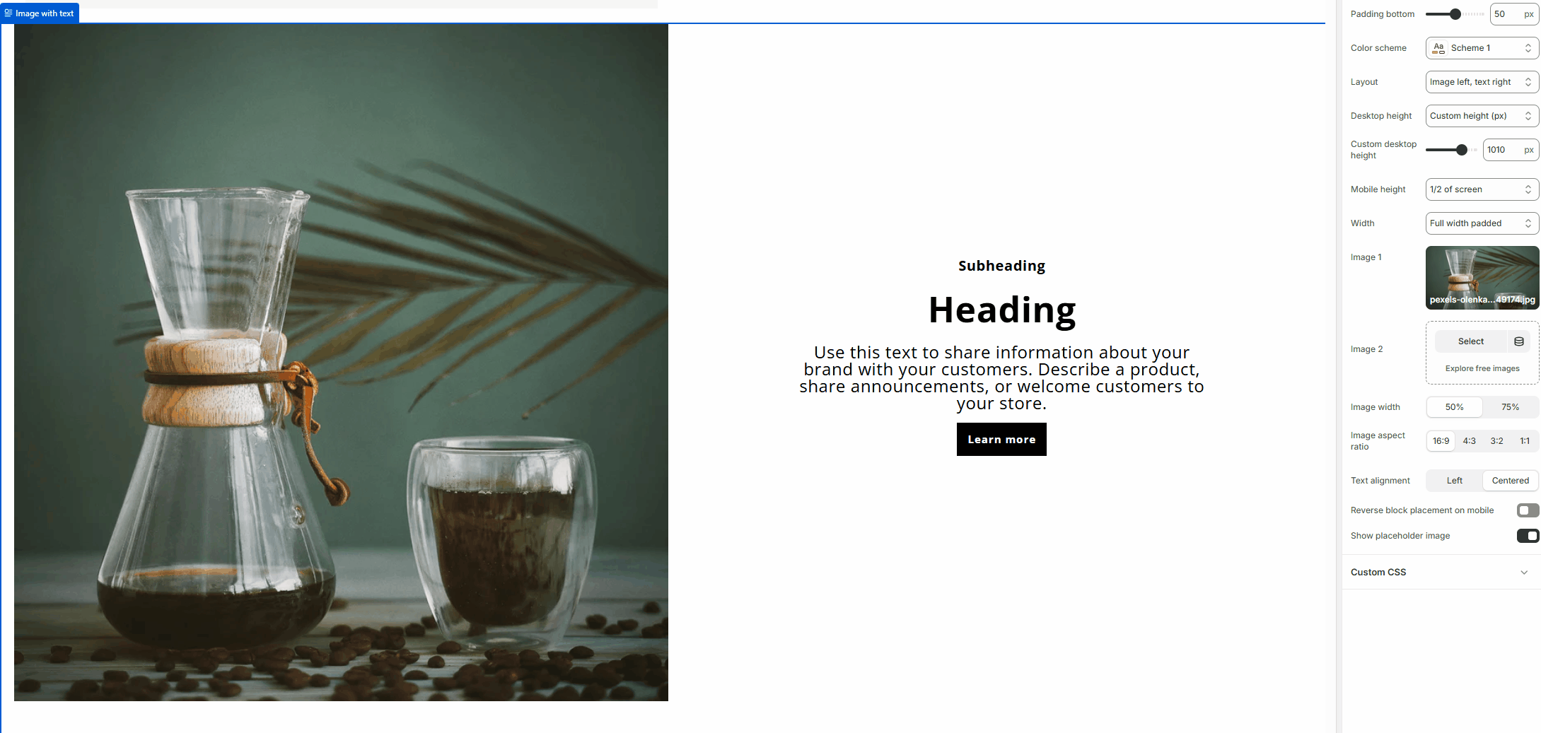
Image with Text
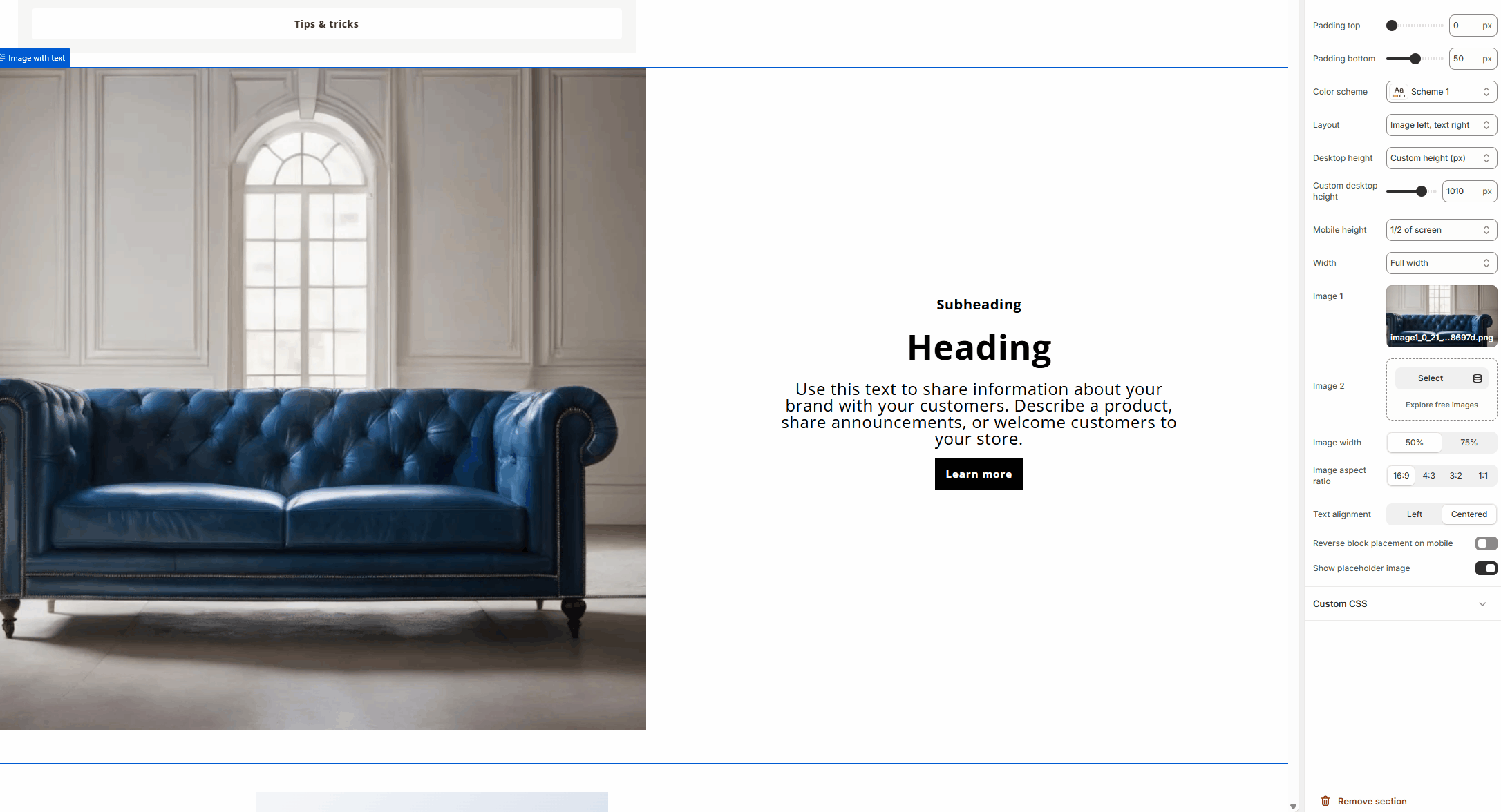
The Image with Text section allows you to combine images and text side by side for storytelling or promotional purposes. The Image with text section allows you to combine images, text, and rich content in a flexible two-column layout. It supports multiple content blocks, responsive height controls, and customizable image and text alignment.
How to Activate
- Go to Theme Editor
- Navigate to Online Store > Themes > Customize.
- Click Add section and select Image with Text.

- Upload an Image
- Click Select Image to upload an image.
- Add Text and Links
- Enter a heading and description.
- Include a call-to-action button if needed.
- Customize Layout and Alignment
- Choose left or right image placement.
- Adjust text alignment and spacing.
- Save Your Changes
- Click Save to apply the layout changes.
Best Practices
- Use lifestyle images for a more relatable approach.
- Keep the text concise and engaging.
- Ensure the section aligns well with surrounding content.
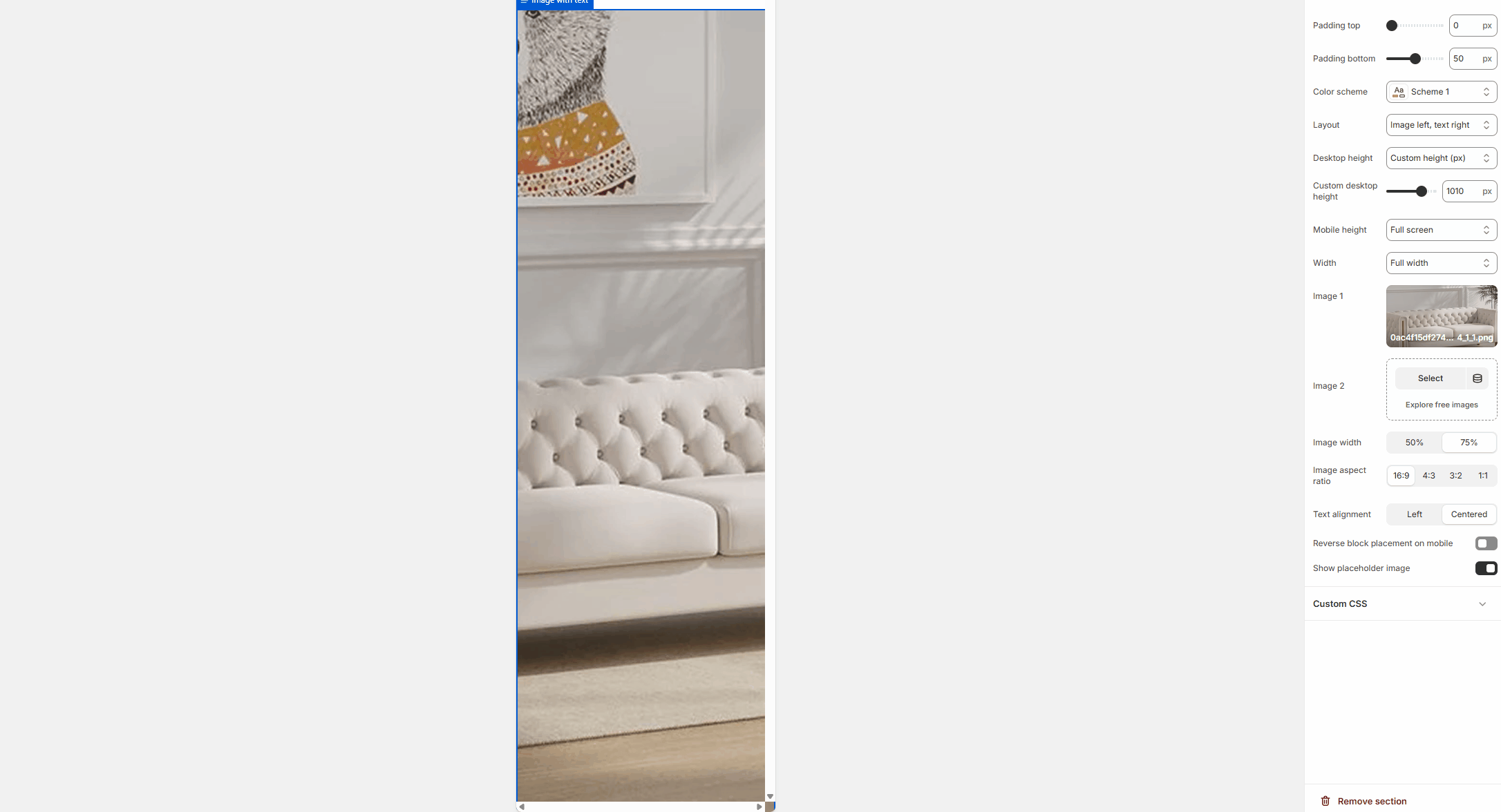
Section settings
Spacing
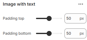
Padding top
Adds spacing above the section.
Padding bottom
Adds spacing below the section.
Appearance
Color scheme
Applies a color scheme to the section.
All text and backgrounds inherit from the selected scheme.
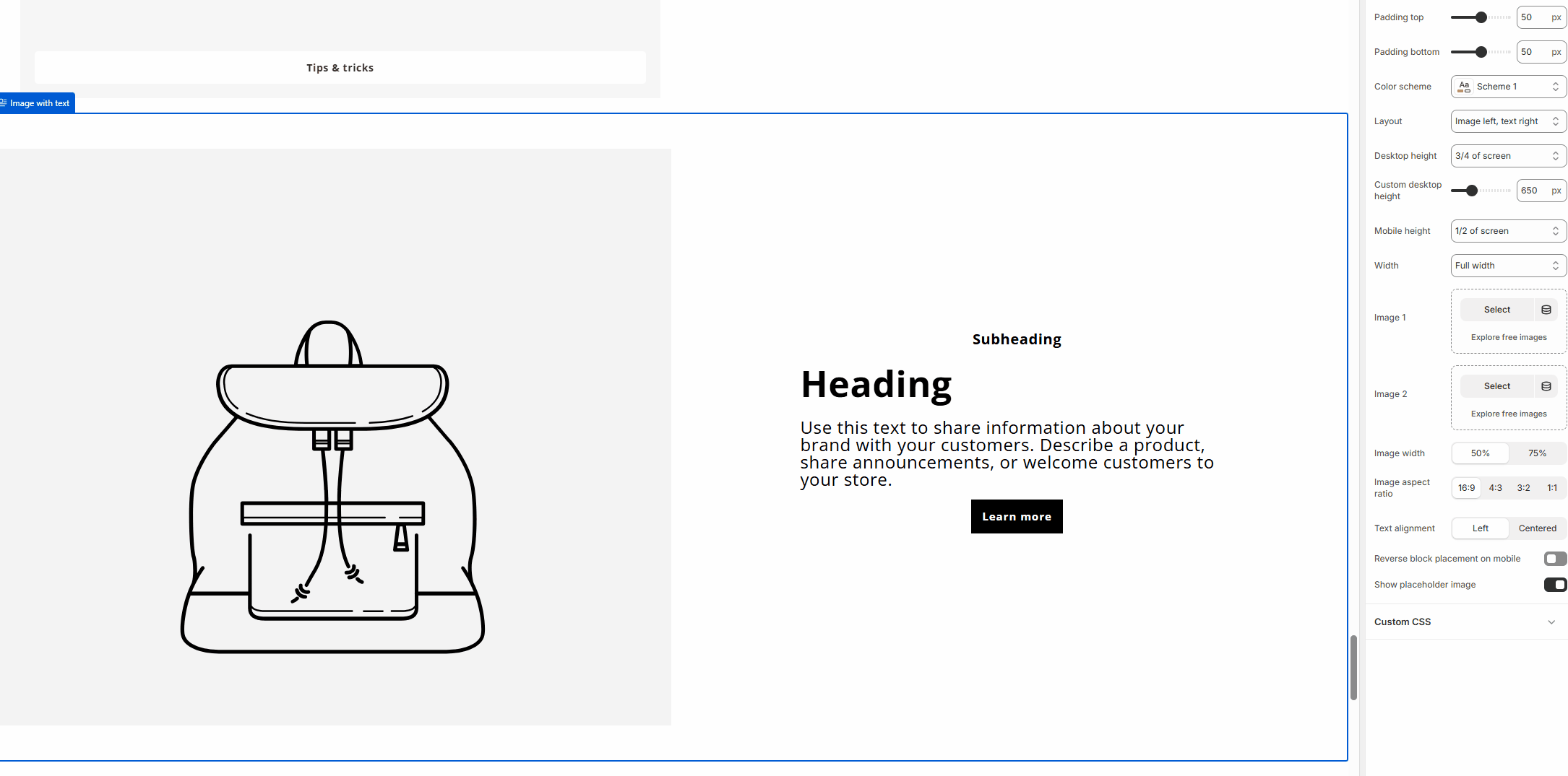
Layout
Controls the position of image and text:
- Image left, text right
- Image right, text left
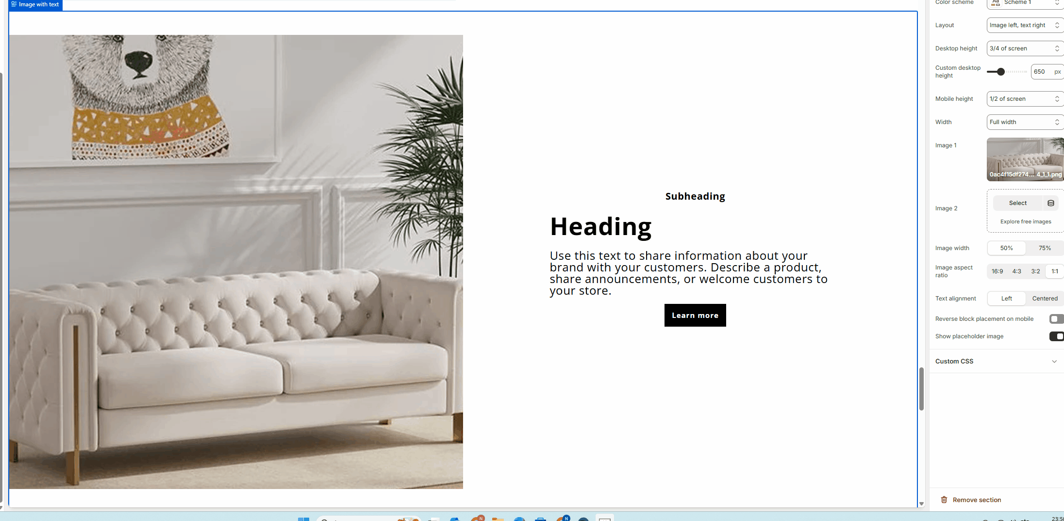
Desktop height
Controls the height of the section on desktop:
- Full screen
- 3/4 of screen
- Custom height
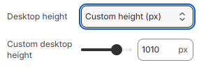
Custom desktop height
Sets a fixed height (in pixels) when desktop height is set to Custom.
Mobile height
Controls the section height on mobile devices:
- Auto
- 1/2 of screen
- Full screen
Width
Controls the section width:
- Full width
- Page width
Images
Image 1
Primary image displayed in the section.
Image 2
Optional secondary image for layered or paired image layouts.
Image width
Controls how much horizontal space the image occupies:
- 50%
- 75%
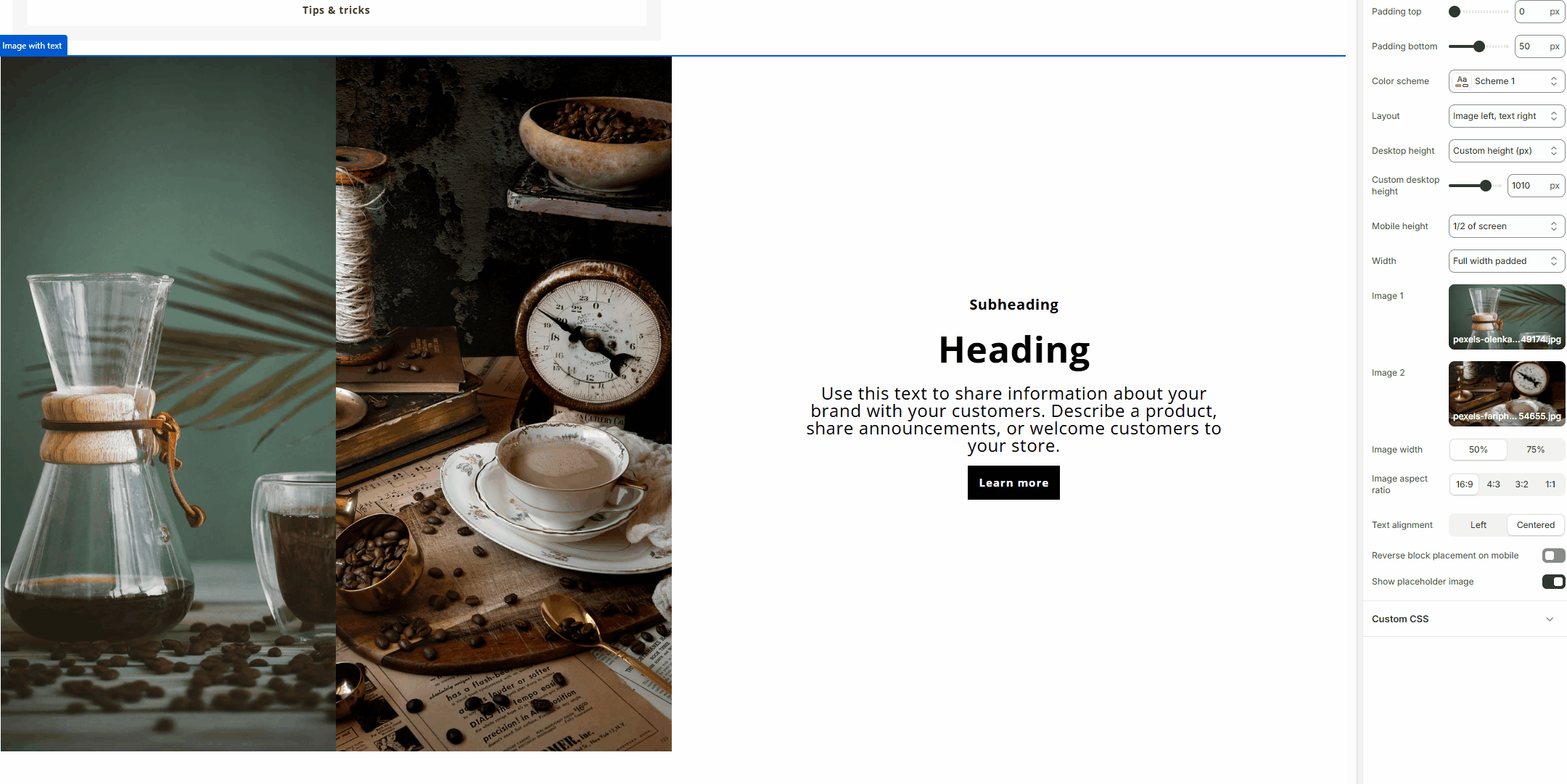
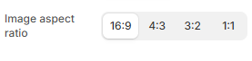
Image aspect ratio
Controls the aspect ratio of images:
- 16:9
- 4:3
- 3:2
- 1:1
Content layout
Text alignment
Aligns text content:
- Left
- Centered
Reverse block placement on mobile
Reverses the order of image and content blocks on mobile devices.
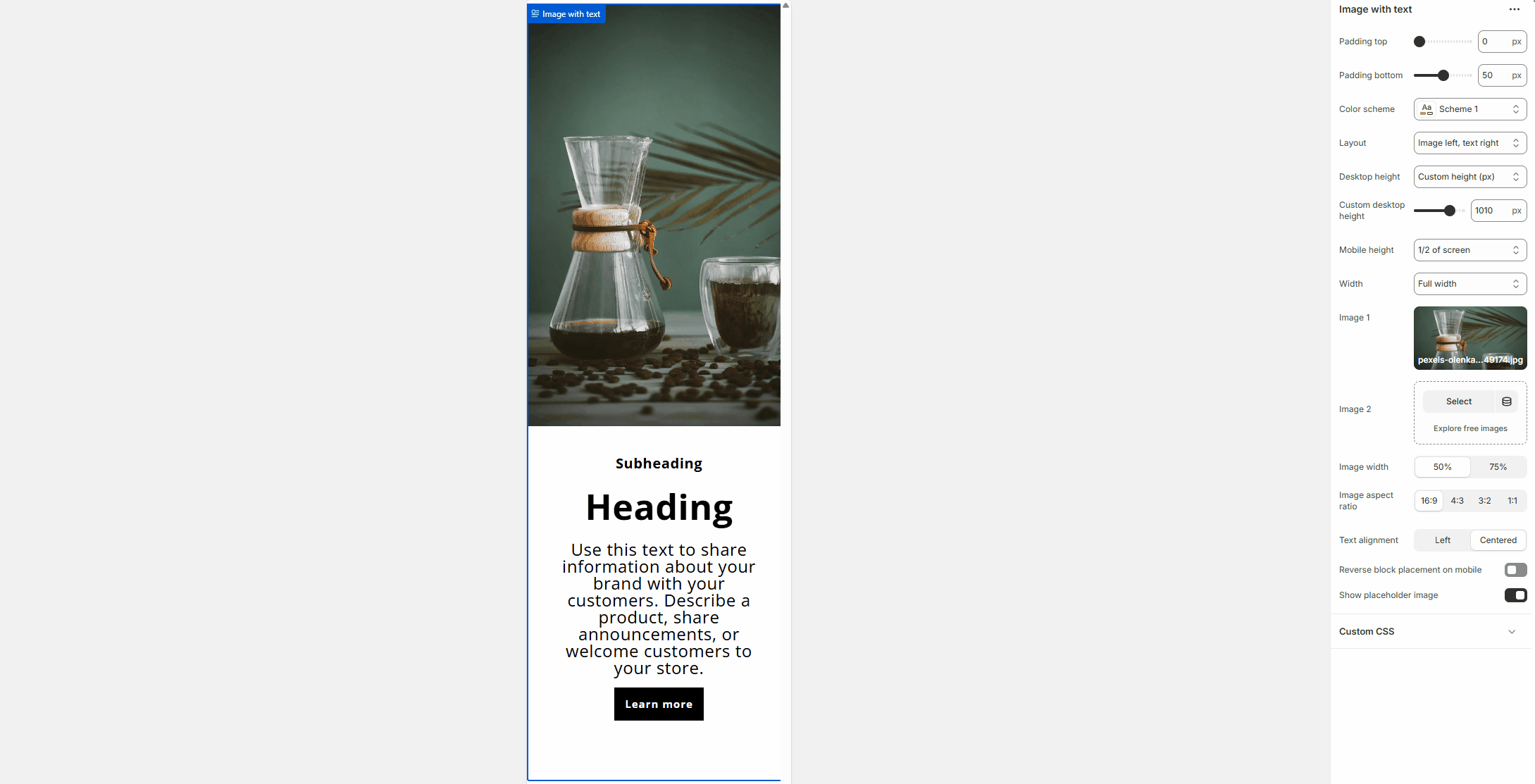
Show placeholder image
Displays a placeholder image when no image is selected.
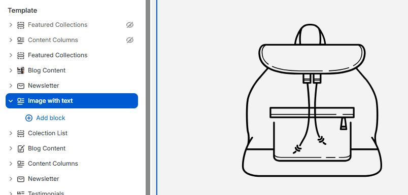
Blocks
The Image with text section is built using flexible content blocks.
Blocks can be added, removed, and reordered freely.
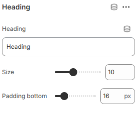
Heading (Block)
Heading
Main heading text.
Size
Controls the heading font size.
Padding bottom
Adds spacing below the heading.
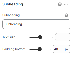
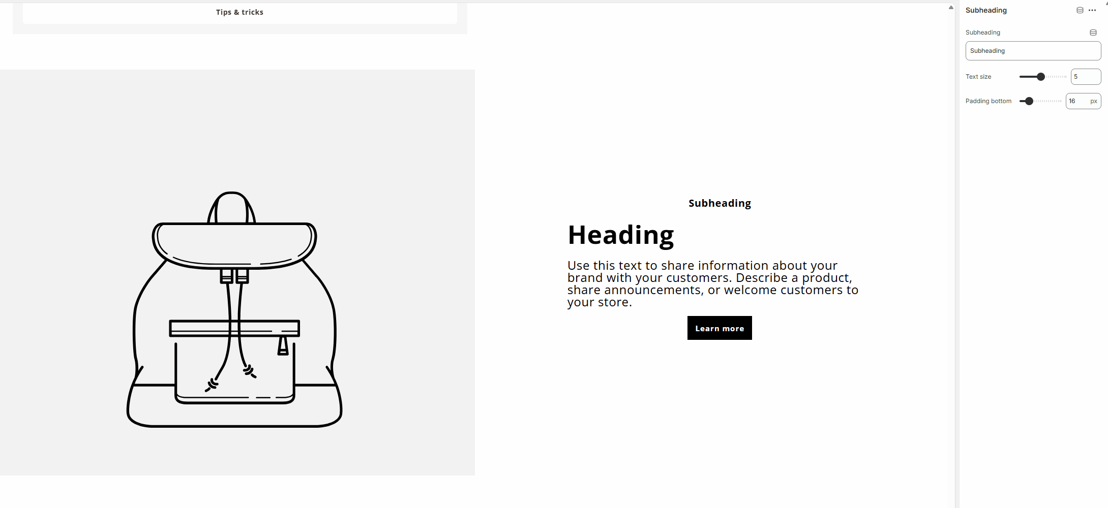
Subheading (Block)
Subheading
Secondary heading text.
Text size
Controls the subheading size.
Padding bottom
Adds spacing below the subheading.
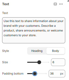
Text (Block)
Text
Rich text content for descriptions or messaging.
Style
Controls text style:
- Heading
- Body
Size
Controls the text size.
Padding bottom
Adds spacing below the text block.
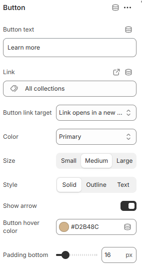
Button (Block)
Button text
Label displayed on the button.
Button link
Destination URL for the button.
Button link target
Controls how the link opens:
- Same window
- New window
Divider (Block)
Show line
Displays a horizontal divider line.
Padding bottom
Adds spacing below the divider.
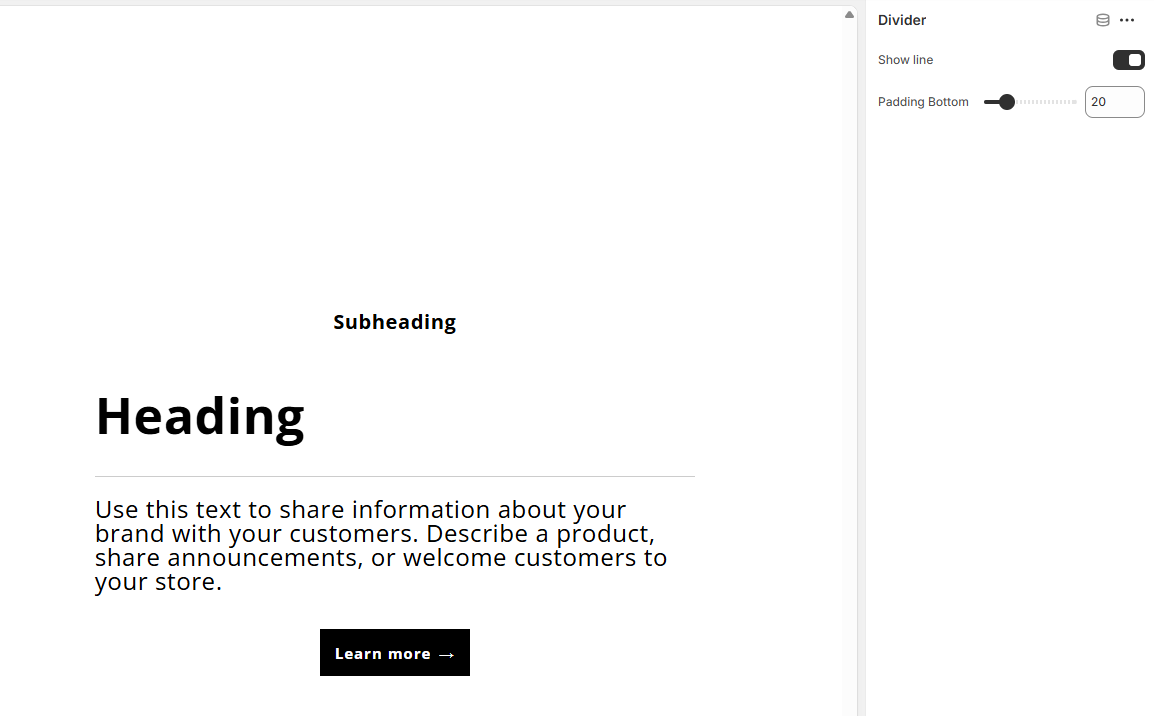
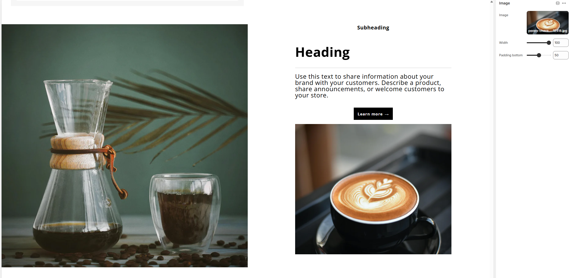
Image (Block)
Image
Selects an image displayed inside the content area.
Width
Controls the image width relative to the content column.
Padding bottom
Adds spacing below the image.
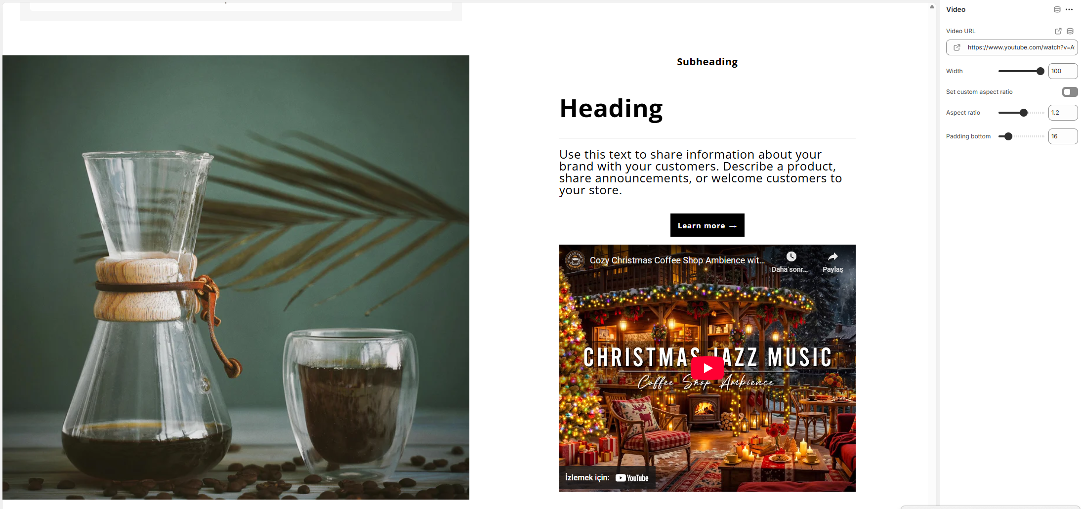
Video (Block)
Video URL
Adds a video from an external source.
Width
Controls the video width relative to the content column.
Set custom aspect ratio
Enables a custom aspect ratio for the video.
Aspect ratio
Defines the video aspect ratio when custom ratio is enabled.
Padding bottom
Adds spacing below the video.
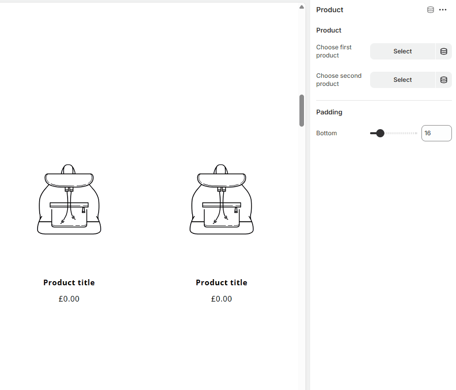
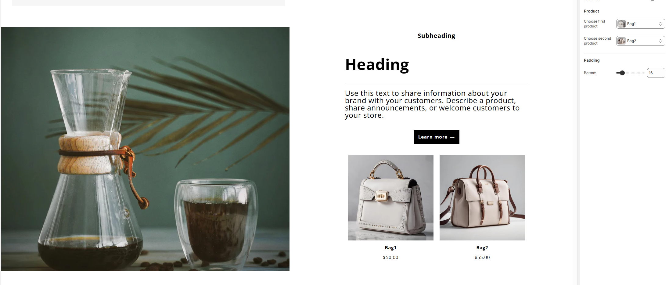
Product (Block)
Choose first product
Selects the primary product to display.
Choose second product
Selects an optional secondary product.
Padding bottom
Adds spacing below the product block.
Custom CSS
Custom CSS
Allows adding custom styles that apply only to this section.
Behavior
- Blocks stack automatically on mobile devices
- Section height adapts based on screen size and selected settings
- Image and content order can be reversed on mobile
- Fully responsive and flexible content composition
Notes
- Use multiple blocks to create rich content layouts
- Combine text, media, and products in a single section
- Image aspect ratio and height settings help maintain visual consistency